

Premium elements in Studio
Studio's demos and their Signature looks are made of these elements, and every project can use them: find them under Elements in the Studio editor, most of them in the Premium group, its maps under Maps. Each one is made of settings you change, like any element. Studio's page draws them as the app does, in light and dark, right to left in Arabic, and phones set to reduce motion show them still. The ones drawn from the person signed in show a sample in Studio and nothing in the app for someone signed out or with nothing to show.
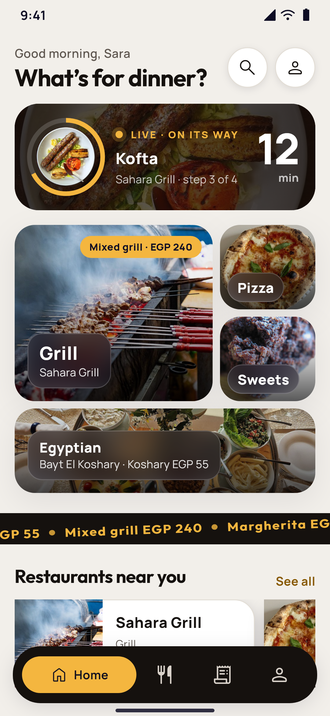
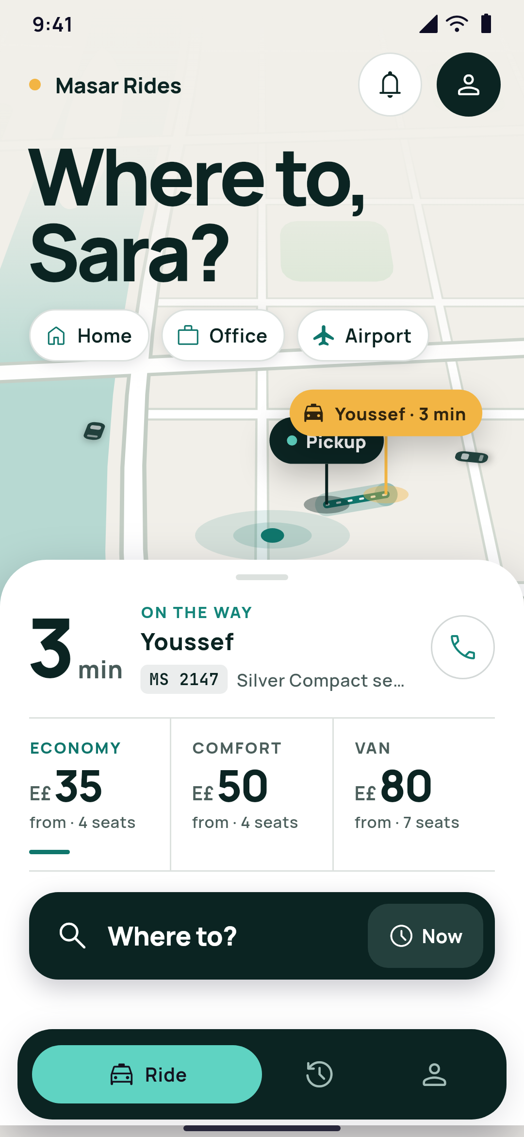
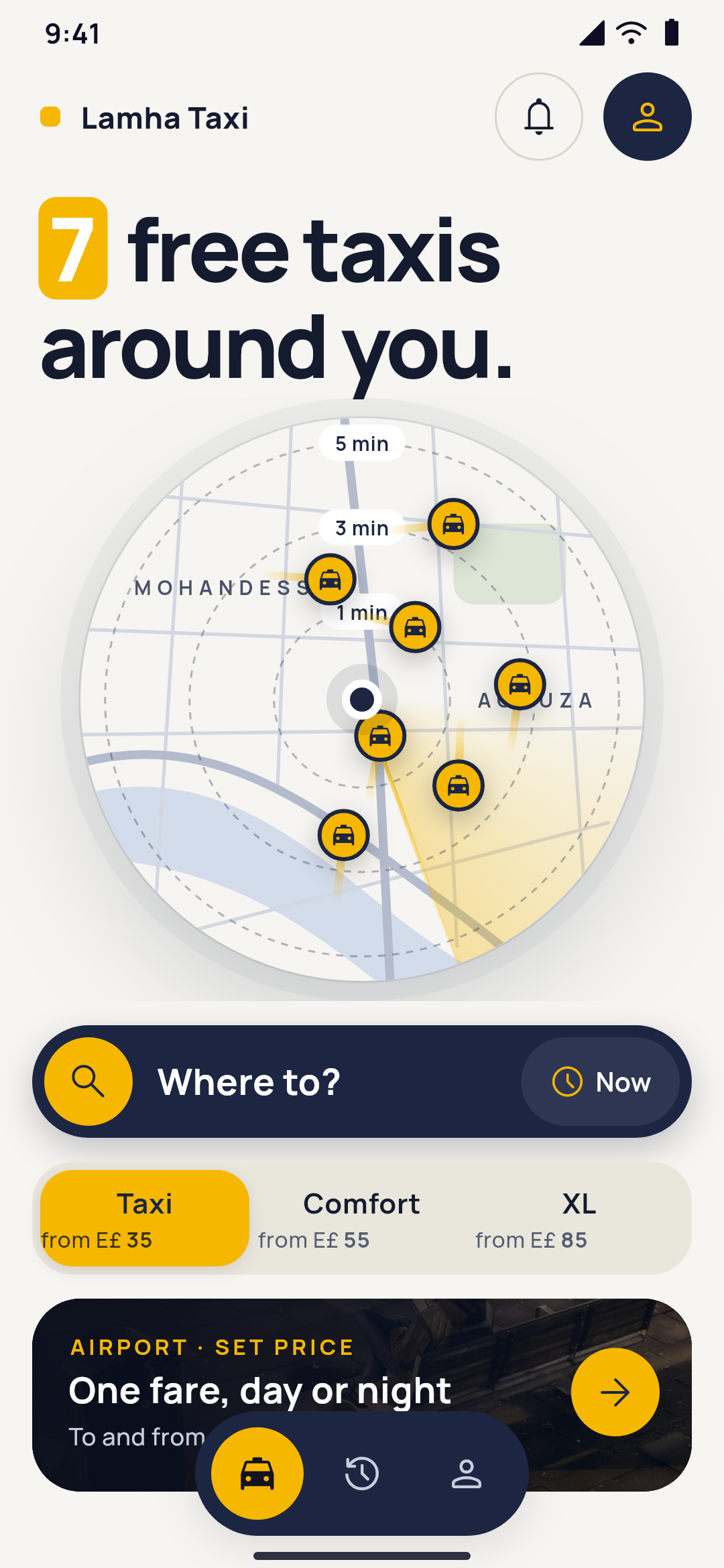
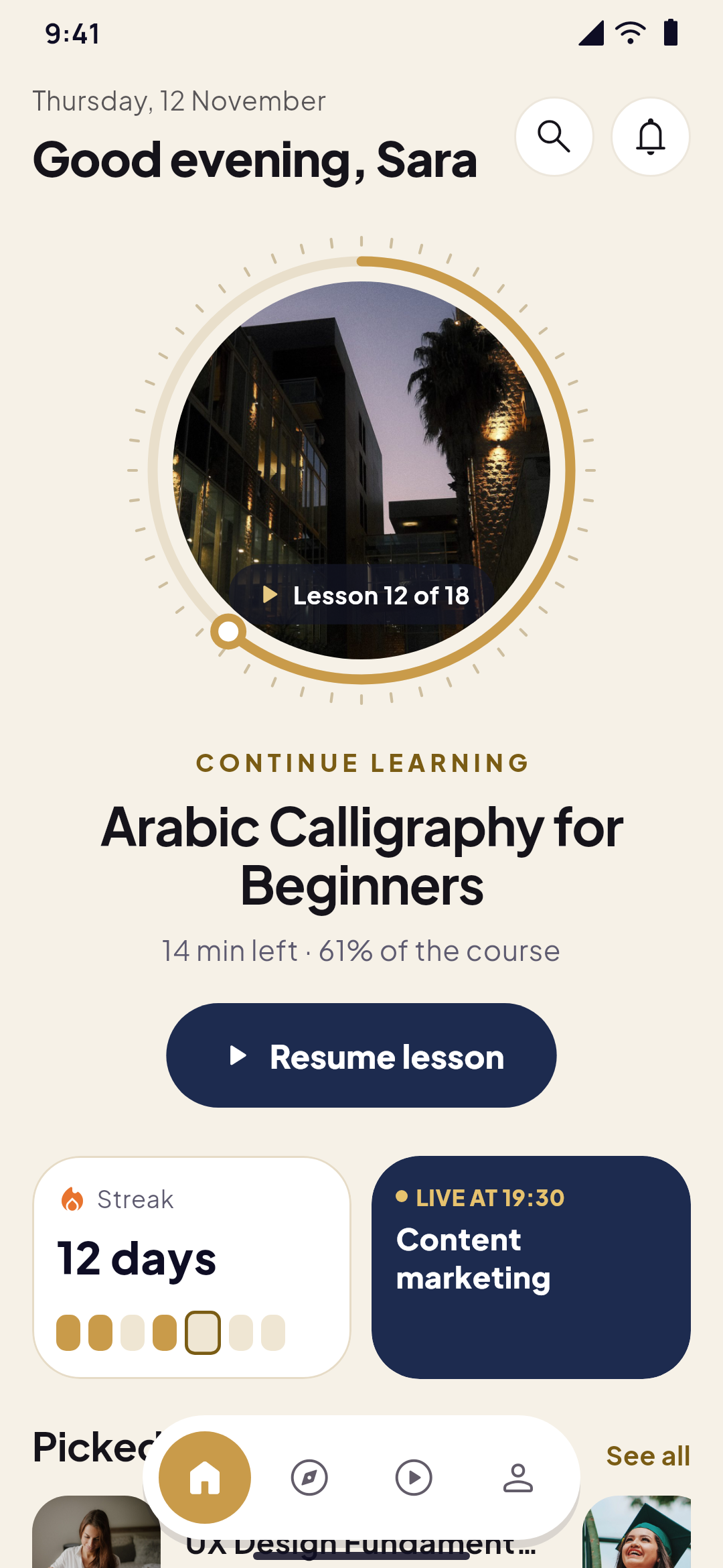
Photo hero
A photo with a shade and elements over it: a big welcome, a photo tile with its caption, or an offer banner. Choose the Picture, the height and the Corners, and add any elements over it: words, a search box, buttons. Last element over the foot makes the last one hang over the photo's edge, like a search card or a route card. Slow zoom on the photo makes it grow slowly, again and again. A page without a header that starts with a cover shows it under the phone's status bar, and a clear header lies over it.
Shade for the words
A shade over a picture so the words on it read: on a photo hero, a Picture, or any element with a Picture behind it. Choose its colour, how dark it is At the start and At the end, and Across, from the start to darken it from one side instead of top to bottom.
Hero slider and card carousel
Two looks of the Slider. The Hero slider shows full-width photos under a shade, each with a small line, a big headline and a button, a line for each slide filling while it waits, and Slow zoom on the photos. The Card carousel shows rounded photo cards, the next one peeking, that move one at a time, with its dots in a Frosted pill over their foot. Indicator sits at the top or The foot, as far From the edge as you set and in Its colour, with a Count beside it like "1/3" or "01/03". A slider stops moving on by itself while it's off the screen.
Progress segments is a bar of short segments, like 18 lessons with 11 done. With The student's course in progress, the app shows the student's own lessons, and leaves the bar out when they have no course in progress.
Stories
A row of round photos in rings, with their titles under them. A ring is lit in your colours until the person has seen the story on their phone, then turns quiet; its Ring can also be Always lit (an offer), Quiet or Dashed (all of them), in its own Ring colour. A tap opens the stories full screen one after another, a line for each filling at the top while it shows (Each story shows for 2 to 15 seconds): a tap on one side moves on or goes back, holding pauses and swiping down closes them. Each story has its photo, its Title under the ring, its Line over the photo and a link its Open button opens: a page, a screen of the app, an entry or a web address. Without a photo, a story shows initials or an icon on its colour.
Ticker
An endless band of Words, a line each, or of Logos or photos, with an icon Between them. Set its Speed, whether it Runs Toward the start or Toward the end, and whether it Stops while pressed. It can be Turned a little, reaching past the screen's sides, with A dot between the words, or Each in an outlined pill. Screen readers read it once, and it stands still while it's off the screen.
Video banner and parallax banner
The Video banner plays a muted, looping video from your Media over its Poster, shown first, under a shade, with your words and buttons over it and a round button to play and pause it. With Plays by itself, muted and looping, it plays only while it's on the screen, and waits on its poster on phones that reduce motion or save data.
The Parallax banner is a photo banner whose photo moves slower than the page as it scrolls: Photo moves at 10 to 90% of the page's speed. Both banners can show their Words in a frosted panel, and under a clear header both are covers, like a photo hero.
Gallery
1 to 30 photos, each with its caption, as a Masonry of 2 or 3 Columns, a Bento of photos, or a Filmstrip that scrolls sideways. Choose the Photos' corners and the Captions over the photos, on a shade or In a frosted pill. A tap opens the photos full screen: swipe through them, pinch to zoom, each with its caption. A photo can open a link instead, like a cuisine's restaurants.
Before and after
Two photos one over the other, with a divider people drag with a finger or move with a tap; the photo before is on the start side. Each photo has its Label on the photo, and Divider starts at sets where the divider starts.
Motion as people scroll
On the Motion tab, When it shows plays once, when the element first comes onto the screen: in the app as people scroll to it, and on Studio's page when it comes into view. Phones and computers set to reduce motion show it still.
Testimonials
Quote cards with the person's photo (else their initial), name, role or city, stars and quote, Side by side, to swipe or Under each other. Write up to 12 quotes, in each of your app's languages, or Show real reviews from the app: a course's or a product's approved reviews of 4 stars and up with words. Your quotes show while there are none.
Pricing
Plan cards with their name, their price "/ month" or "/ year" in the Currency you choose, what each one includes with a check, a button, and the Most popular (highlighted) one in your two brand colours. A Monthly / yearly switch can sit over them. No price is filled in for you: until you write one, Studio shows Set a price where it goes, and the app shows none.
Numbers
Big numbers with their labels, words before and after them ("+", "%", " min") and an icon, counting up once when they show. Show them In cards or with Lines between them, and one of them In the second colour. Show the values without counting up keeps them still.
Progress
Bars with their label and share, Rings with the share inside, or Segmented bars, filling once when they show. A ring has its Ring size and Thickness, and can have Tick marks, A knob at the end, and a Photo inside the ring with a Chip over the photo.
Timeline
Steps with a dot each on a line, with a date, a title and a text; the steps up to The step it is at now are done in your colour. Lay it Down the page, Across, or Across, a bar over each. For a school day or a trip, use Times in a column at the start, The current step as a card and Dates in a monospaced font.
Profile card
A person's or a place's card: its cover photo, a round photo or a rounded square (Photo shape), the name and role, two badges and two buttons you change like any element, and up to 6 Social links.
Bento grid
Tiles of mixed sizes (One cell, Wide, Tall, Large or Across all) in 1 to 4 columns, each on its photo under a shade, on a gradient or on a soft card, with its icon, title, text and link. Its Tiles' words can sit On frosted glass, with a Chip at its top.
Glass cards, tickets and textures
A Row, Column, Layers, Grid or Profile card can take a Premium card style: Frosted glass that blurs what's behind it (its Blur and How white), a Border in two colours, a Glow inside and a Soft shadow, together as you like. Ticket, perforated cuts round notches into both edges with a dashed line between them, across or Perforated down instead of across, like a boarding pass or a school pass. Texture adds grain, a dot grid, a grid or stripes. Glass card in the Premium group is a column of frosted glass with a border in two colours.
Badge
A badge or chip with its words and icon: Pill, Outline, Gradient, Glass, or Gradient words, a heading in your two brand colours without a chip. Put it in a row beside a heading.
Action bar
A bar with a button at the page's foot, with its label, like a price you write yourself, that Stays at the foot while the page scrolls, above the tabs; A floating round button; or A floating card with an icon at its start.
Map header
A drawn map at the top of a page, with its Markers, the Markers' icon, Markers' colour and Markers' tile, and The person's dot in the middle. In the app, the free taxis near the person shows the real taxis, live, in place of the markers. With Last element over the foot, the last element becomes a sheet over the map's foot.
The maps' premium looks
A map header can take a Map look: Living map (a curved river with its island, streets, avenues and parks), Horizon (the city tilted towards a foggy horizon, with room for a headline over the fog), Two inks (printed in the markers' two colours, the markers as roof signs, with a checker band at its foot) or Radar lens (a round radar with 1, 3 and 5 minute rings and a slow sweep, the taxis around with their trails). The app draws each one, by day and by night, without map tiles, and turns it for Arabic.
Every look can have Labelled pins (Home, Office), Words on the map, Where the person's dot is and How the markers look: a tile with the icon, a car from above, a roof sign or a token with a trail. Under Maps in the Premium group, they're ready as Living map, Horizon map, Two-ink map, Radar lens and Live route map.
Live route
A route on any map look is drawn through its points, solid up to where the vehicle is and dashed after it, the vehicle pulsing, with a chip at each end and a bubble by the vehicle, like "3 min". With In the app, the route follows set to The person's ride on its way or The person's shipment on its way, the app draws their own ride or shipment from its real places, and nothing when there is none.
Greeting
Good morning or good evening with the person's first name, in the app's language. Its words can be your own instead, with {name} where their first name goes, and Without a name is what people who aren't signed in see: "Where to, Omar?" and "Where to?". The header 6 Greeting with the person's name puts the greeting and today's date at the top of the page, with its buttons beside it.
Live order
For food delivery and multi-vendor apps: the person's order on its way, with what it is, how far along it is and the minutes left. Choose Whose order and its icon, and its Look: a Card, Big minutes, stages as bars, Photo in a progress ring, Slim pill with Track or Named stages on a line, with its Accent and Accent at night.
Live card
For delivery, ride, taxi and travel apps. What it follows: Their shipment on its way, Their ride, The taxis near them or Their next trip (their soonest booking: its city, the days to it, the stay and its legs). How it looks: A card with the stages, The driver and the car (their photo, car, rating and plate, with a call button), One line, the same premium looks as the live order, A ticket (the trip's first flight as a boarding pass, with the airports' codes, the times, the seats and a button for the boarding pass) or The number, large (the minutes to the pickup with the driver and the car, or how many free taxis are around). Photo while the driver has none fills in until the driver adds theirs.
School day
For schools: one part of a family's school day, from the parent's own children. Which part: The greeting with today's date, The children to switch between, or Today: check-in, class and bus for the chosen child: in at the gate, the class now and the next, and the bus home.
The student's cards on a photo
For academies, the Student's card shows The course they're taking, their Learning streak, their Next live class or This week's learning time. Its How it looks can be A card, On a photo or In a gold ring. On a photo: the course over its picture under a dark shade, the lesson and the minutes left on one chip, how far they are in gold and a round play button; the live class's time in gold over its name; the streak as one figure. In a gold ring: the course's photo in a round frame with a gold ring filled to how far they are, the lesson on a chip and a button to resume it. Under a streak, This week's days shows the days they learned in gold and today ringed, as Round letters or Short pills.
Ratings on a card
In a list's own card, set an element's Shows from the entry to The rating: the entry's rating with a star, after the element's own words, like "Omar Farouk · 4.8/5". Nothing shows for an entry without one.
Borders by night
Once an element has a Border, In dark mode gives it its own border colour by night.
Floating bars
Under Bottom tabs, two designs float over the page in their own colours, and the page goes on under them. Floating pill: the open tab a filled pill with its name, the others icons only. Small dock: a capsule in the middle as wide as its icons, the open tab a filled circle.
Places as chips, a deck and the address bar
In a multi-vendor app, the places can show as Chips (each place's photo beside its name, rating and time), or as a Deck of cards: the open place in front with its club benefit or offer, the next two peeking behind it, and a swipe bringing the next one. The address and search can show as a Bar with the soonest time an open place delivers in.
Premium headers
Select the page's Header and choose a Premium style, drawn in place of the header's type: Large title, a big title with a Line under the title; Frosted glass, a bar the page scrolls under; Photo cover, a photo under a shade with the title over its foot (Choose the photo, or your main and second colours); Brand in the middle, your logo on your main colour; or Title + search, the title over a search pill that stays. The large title, the photo and the search fold into a small bar as the page scrolls, unless you turn off Folds into a small bar on scroll. Their buttons are round and glassy: the bell has a dot while the person has unread notifications, the account shows their photo, and a page opened over the tabs has a round back button. None (the type above) keeps the header's type.
The app's own screens in a premium look
With nothing selected, the page's settings have the System screens' look, for the whole project. It's also under System screens on Sign-in and account in your project's menu, where you design the sign-in screen and the account menu. Choose The app's own (every screen as it is today), Large title, Frosted glass, Photo hero (a photo under a shade at the top: choose one, or the sign-in's photo shows) or Brand hero (your main colour across the top with your logo).
The look is for the account (the person on a card, a few numbers from their own data and your entries grouped, with Sign out last), settings, notifications, the language, editing the profile, help, about and the legal pages, the lists of orders, bookings and trips, sign-in and the code screen, and the empty and loading states, which load as a shimmer in your colours. Another look for one screen gives one screen a look of its own. The app shows it the next time it opens, with no new build. Existing projects keep their screens until you choose a look; projects made from a demo, one of its looks or a whole design start with theirs.