

The Studio editor: every element
In Yallapp Studio a page is made of elements: drag one from Elements and drop it anywhere on the phone, or search for it with Search for an element. Select an element on the page or in Page layers, and its settings open beside the phone in three tabs: Design, Motion and Data. This page lists every element and every setting.
The photo-first elements Studio's demos are made of, like the photo hero and the live order card, are on Premium elements in Studio. Ready-made sections and whole pages are on Ready sections, templates and Studio's demos.
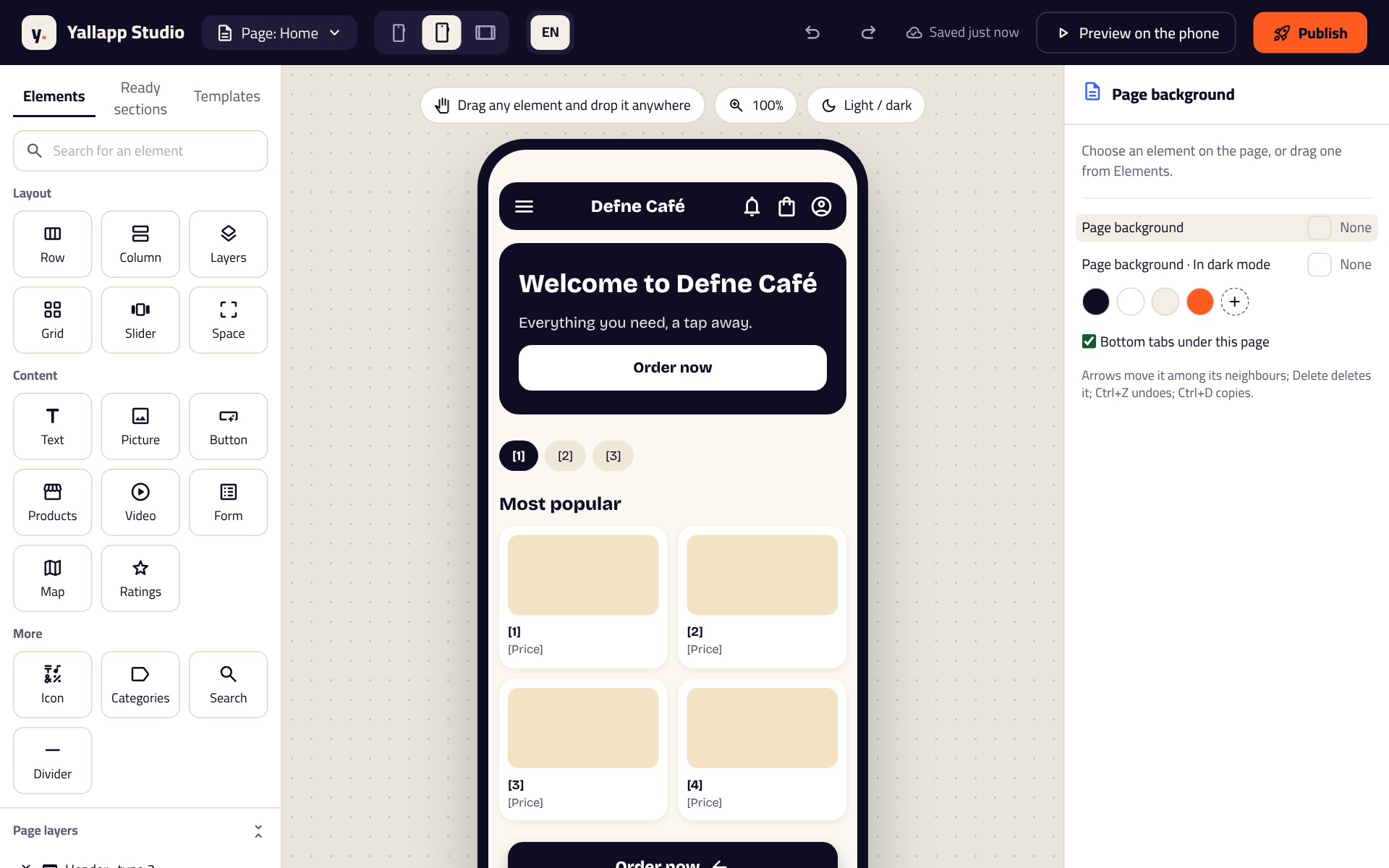
Layout elements
They hold other elements and place them.
- Row: side by side. Space between sets the gap, Spread how they share the row (Start, Middle, End, Spread out or Even) and Line up how they sit across it (start, middle, end or Stretch). Scrolls sideways makes a row wider than the screen that people swipe.
- Column: one under the other, with the same settings.
- Layers: one over the other, like words over a picture. Each element inside can have its Place on the picture, across and down in percent, for a spot people tap on a photo, or line up as in a column.
- Grid: tiles in Columns, with Space between.
- Slider: slides people swipe. Shown at a time, Seconds per slide (2 to 10), Plays by itself, Shows where it is (Dots, Lines that fill or a Number) and Proportions (16:9, 4:3 or square). Slides' words and Darken the slides' pictures change every slide at once; each slide can still be changed on its own.
- Space: empty space, as high as you set it.
- Questions: questions that open to show their answer. Each one's question is in Its question or tab name; its answer is what it holds.
- Tabs: parts people switch between. Each tab's name is in Its question or tab name.
- Photo hero and Map header: covers with elements over them; and in the Premium group, the Hero slider, Card carousel, Video banner, Parallax banner, Glass card and Profile card. All of them are on Premium elements in Studio.
Put in a Row, Column or Layers wraps the selected element in a new one.
Content elements
- Text: your words, with the Font, Weight, Size, Line height, Letter spacing, Italic, Underline, Struck through (an old price), Capitals, where the text lines up and Lines at most. Text style makes it follow one of the project's styles (Heading, Subheading, Body text or Button).
- Picture: from your Media or from Yallapp's pictures. Fit is Fill the space or Show it whole; Proportions keeps its shape; Colour over the picture, with its Strength, and Shade for the words keep words on it easy to read.
- Button: its words, an Icon first or last with its Icon size, and what it opens under When the customer taps.
- Icon: one icon, at the size you choose.
- List: your entries, in a card. It is named after what it shows: products, courses, services, articles, posts, listings, events, campaigns, delivery services, restaurants, vehicle types, school news or course bundles. See the next part.
- Categories: your categories, as Chips, Tiles, Pictures or Round pictures.
- Video: a YouTube, Vimeo or MP4 address, which Plays by itself if you like.
- Form: your Questions (a short or long answer, an email, a phone number, a number or a choice), each Required or not. Answers go to your email or the chat; set the Button text and the Text after sending.
- Map: The place, by latitude and longitude, with a place name.
- Ratings: stars, from 0 to 5 by halves, and the words beside them.
- Search: a search box, with the words shown in it.
- Divider: a line between parts.
- Countdown: the days, hours, minutes and seconds until Ends at. Once the time is up shows your words, or nothing when it's empty.
- A List with an icon on each line: One line each, and the Icon of each line.
- Coupon code: The code (letters, numbers, - and _), which people copy with one tap.
- Greeting, Live order, Live card, School day and the Student's card: drawn from the person signed in, on Premium elements in Studio.
- In the Premium group: Stories, Ticker, Gallery, Before and after, Progress segments, Testimonials, Pricing, Numbers, Progress, Timeline, Bento grid, Badge, Action bar, and under Maps the drawn maps in their premium looks, on the same page.
- In a multi-vendor app, the multi-vendor section: the address and search, the kinds of places, the offers, the cuisines and departments, the club, the places or order again, filled from your places. For places, choose the look, which places (all, restaurants or groceries), the order, a tag, free delivery only, how many (up to 40) and what each place's card leaves out (the offer, rating, delivery time, delivery fee or smallest order).
Lists and their cards
On the Data tab, a list has:
- Shows: which entries, and As: a Grid, a List or a Carousel.
- How many, and Order: newest, most popular, lowest or highest price.
- Featured only, one Category, On sale only, and for products What this person opened lately, kept on their phone and hidden until they open a product.
- Card: The app's card, or My own card. Design the card opens one entry's card: lay it out with any elements, and set each one's Shows from the entry to The title, The line under it, The picture, The price, The badge or The rating. Every entry is drawn with your card.
Studio's page shows your own entries, or sample ones until you add yours, so you see the real card.
Settings every element has
- Size and place: Width and Height each Fill the space, Hug the content or are Fixed; Lowest height and Proportions; Space inside and Space outside, the same on opposite sides or each side on its own; Fixed on the screen, at the top or the bottom.
- Colours: Background, Text colour, a Gradient of two colours at an Angle, and a Picture behind it. In dark mode gives the background, the text and the border their own colours by night.
- Shape: Corners, or Each corner on its own; Shadow (none, light, medium or strong); Border; Opacity; Turn.
- Motion: When it shows (fade in, slide up, down, from the start or the end, or grow) with its Time (ms) and Wait before (ms), played once when the element first comes onto the screen as people scroll to it; While tapped (shrink or bounce); Again and again (pulse, float or shake). Play it shows it on the phone. Phones set to reduce motion show it still.
- When the customer taps: A screen of the app, A page, A web address, One entry or A course.
- Shows on Android, iOS or both, and Who sees it: everyone, people signed in, or people not signed in.
- Hide in the app (kept here), Lock on the canvas, and its Name in the layers.
Phones and tablets
Check each page on a Small phone, a Large phone and a Tablet, in light and dark. On the tablet, what you change is Changing it for tablets: widths, heights, spacing, columns, slides shown at a time and text. Phones keep theirs, and Same as on phones takes it back.
The page, its header and its tabs
- Header: No header, or one of six: 1 Logo in the middle, 2 Title + search, 3 Logo + cart + account, 4 Clear over the picture, 5 The page's title and buttons and 6 Greeting with the person's name. Choose its buttons (menu, search, cart, notifications, chat, account) and its colours, in dark mode too. A clear header lies over the page's first element, from the very top. A Premium style (a large title, frosted glass, a photo cover, your brand in the middle, or a title with search) is drawn in place of the type: see Premium elements in Studio.
- Page background, Bottom tabs under this page, and The app's screen under this page: the app draws one of its own screens (its lists, forms or map) under your elements, and your header becomes its title.
- Bottom tabs: up to ten. Up to five show in the bar; with more, the fifth becomes More and holds the rest. Each tab has its name and icon. Under How the bar looks, choose the Design (Classic, Pill, Minimal, Dot, Line, Bubble, Glass, Notch, Lift, Outline, Square, Names only, Island, Segment, Folder tab, Drop, Glow, Colours, Floating pill or Small dock), the Open tab and Other tabs colours, Corners, Space around it (floating), the names' font, Names (always, open tab only or icons only), a Round button in the middle and The account tab shows the person's photo.
- System screens' look, with nothing selected: the look of the app's own screens (the account, settings, notifications, sign-in and more) for the whole project.
Working faster
- Copy, Cut and Paste, also onto another page or into another project; Duplicate; Copy style and Paste style; Move up and Move down; Select what holds it.
- Arrows move an element among its neighbours, Delete deletes it, Ctrl+Z undoes, Ctrl+D duplicates, and Ctrl+C and Ctrl+V copy and paste (⌘ on a Mac). Press ? for every shortcut.
- Drag an element's corner to make it bigger or smaller; hold Shift to keep its shape, and double click the corner for its own size again.
- Text styles: change a style once and every text using it changes, on every page.
- Pictures: drag one of Your pictures or Yallapp's pictures onto the phone.
- Import a design…: SVG files from your design tool, a Figma link, or a .yallapp file. Export this page as a file, the selected element, or Export the whole project as a file moves designs between projects and accounts.
- Published versions: Bring back an earlier publish as your draft; what's live stays until you publish again.
Undo and Redo go back and forward, and the page is saved as you go. Publish sends it to your app, which shows it the next time it opens.